When therapy clients start comparing options, is your website helping them choose?
Have you ever looked at your website and thought, “This looks nice, but I’m not sure it is helping people decide”?
The colors are fine. The photos are warm. The service pages are professional. The contact button is there.
But new client inquiries still feel inconsistent.
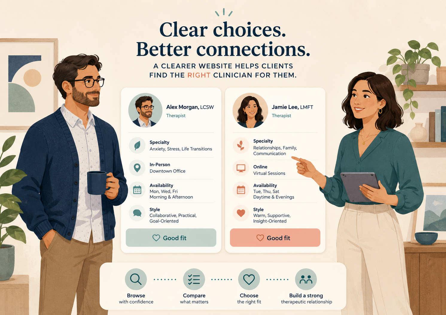
Some people reach out and are a great fit. Others ask questions that are already answered somewhere on the site. Some are looking for a service you do not provide. Some compare fees, insurance, availability, clinician style, and location, then disappear.
That does not always mean your website needs a full redesign. Sometimes it means your website is missing one simple decision-making section.
Clients are not just finding you. They are comparing you.
People looking for therapy are often sorting through options while already feeling stressed, tired, unsure, or overwhelmed. And access can feel hard.
So a potential client may not only be asking, “Can anyone help me?”
They may be asking:
- Who feels like the right fit?
- Can I afford this?
- Do they take my insurance?
- Do they work with my concern?
- Can I meet online?
- Do they have appointments soon?
- What happens after I reach out?
If your website does not help them answer those questions, they may keep comparing.
Many service pages describe the service, but do not help the person choose.
A page may say:
“We provide compassionate therapy for anxiety, depression, trauma, relationships, and life transitions.”
That is warm. It may even be true.
But if five other practices in town say something similar, the visitor still has work to do. They have to figure out whether the page is speaking to their situation, whether the clinician is a good match, and whether the next step is worth taking.
This matters most when someone is in the comparison stage.
That simply means they are not casually browsing anymore. They are more specific in what they are looking for.
They may search:
- “anxiety therapist near me”
- “online therapy for teens in Pennsylvania”
- “trauma therapist accepting new clients”
- “couples therapy that takes insurance”
- “therapist for burnout and work stress”
- “EMDR therapist near me”
- “therapy for college students online”
These searches tell you something useful.
The person is trying to narrow the field. They may already believe therapy could help. Now they are comparing fit, location, specialty, cost, availability, insurance, clinician style, and next steps.
A vague page does not support that decision.
This is also why local search and service page clarity belong together. If someone finds your practice through Google but lands on a page that does not explain fit, the search did its job but the page did not. For the local visibility side, read Local SEO for therapists: how to show up for right-fit local searches.
It may bring the visitor to the website, but then leave them alone with too many unanswered questions.
Comparison is where website clarity matters most. A stronger Therapy website strategy: why visitors do not become inquiries helps visitors understand fit, services, fees, availability, and the next step without having to piece everything together themselves.
Add a “This may be a good fit if…” section to one service page this week.
Not every page. Not the whole website. Not every clinician bio. Start with one service page.
Choose a page for a service you want more right-fit inquiries for, or a service that gets interest but also gets confusing questions. This could be anxiety therapy, couples therapy, trauma therapy, teen therapy, EMDR, assessment services, online therapy, medication management, or another core offer.
Then add a short section that helps the visitor recognize whether the service fits their situation.
Use plain language.
This may be a good fit if…
- You are looking for support with [real-life problem].
- You want help understanding [common struggle].
- You prefer [therapy format, clinician style, or type of support].
- You are available for [online, in-person, daytime, evening, or location-specific appointments].
- You are hoping to [reasonable goal or next step, without promising an outcome].
You can also add a softer boundary:
This may not be the right fit if…
- You need immediate crisis support.
- You are looking for a service we do not currently offer.
- You need a higher level of care than outpatient therapy.
- You need a specific insurance, location, or appointment time we do not have available right now.
This is not about turning people away coldly.
It is about helping the right people feel less confused and helping poor-fit inquiries self-select before your intake team spends time untangling the mismatch.
That is better for the visitor, too.
A person looking for help should not have to submit a form just to learn that the practice does not serve their concern, take their insurance, offer their needed appointment type, or work with their age group.
Clarity is kind.
What this could look like on an anxiety therapy page
Before:
“We offer anxiety therapy for adults using evidence-based approaches in a warm and supportive environment. Our clinicians help clients manage stress, anxiety, panic, and life transitions.”
That is not bad. But it is broad.
After:
This may be a good fit if…
- You often feel stuck in overthinking, worst-case scenarios, or constant mental planning.
- You are functioning on the outside but feel tense, distracted, or exhausted inside.
- You want therapy that helps you understand your anxiety patterns and practice new ways to respond.
- You are looking for weekly outpatient therapy, either online or in person.
- You want a therapist who is warm, practical, and comfortable helping you slow things down without making you feel judged.
This may not be the right fit if…
- You are in immediate danger or need emergency support today.
- You are looking for intensive daily treatment or a higher level of care.
- You need evening appointments only, and our evening spots are currently full.
- You are looking for medication-only services, and this page is for therapy.
Notice what changed.
The second version does not make dramatic promises. It does not claim to cure anxiety. It does not pressure the person to book.
It simply helps the visitor compare their needs with what the practice actually offers.
That one section can reduce vague inquiries, repeated intake questions, and poor-fit consults.
It can also help your admin team.
When the website explains fit clearly, the intake conversation starts from a better place. The person has already seen who the service is for, what kind of support is offered, and what the next step might be.
Read one service page like a potential client comparing three options.
Can they quickly answer these questions?
- Who is this service for?
- What real-life problem does it help with?
- Which clinician or type of clinician might be a fit?
- Is it online, in person, or both?
- Are fees or insurance easy to find?
- Is availability mentioned clearly enough?
- What happens after they reach out?
Now choose the one question your page answers least clearly.
That is where your “This may be a good fit if…” section should start.
You do not need perfect wording. You need useful wording.
Try writing five simple bullets this week. Then ask your intake coordinator, admin assistant, or a trusted clinician:
“Would this help the right person decide whether to reach out?”
If the answer is yes, add it to the page.
Two free tools to check the path before rewriting everything.
Before you rewrite several service pages, check where the website path may already be creating confusion.
These two free Practice Growth Lab resources can help you look at the issue from two useful angles: local visibility and website clarity.
Local SEO Visibility Scanner
Use this if you want to check whether your practice is clear enough for right-fit local searches. It can help you spot simple gaps around local visibility, service page clarity, Google Business Profile signals, and the path from search to inquiry.
Therapy Practice Website Scanner
Use this if you want a quick read on whether your website clearly explains your services, intake process, pricing or insurance information, referral fit, and next step.
You do not need to fix everything at once. Use the scans to choose one service page, one local visibility gap, or one unclear next step to improve this week.
Your website does not need to sound impressive. It needs to be helpful.
When someone is comparing therapy options, your website does not need to sound impressive.
It needs to be helpful.
A clear fit section gives the visitor a calmer way to decide. It helps right-fit clients see themselves on the page. It helps poor-fit visitors move on sooner. And it gives your team fewer avoidable questions to clean up later.
Try adding one “This may be a good fit if…” section to one service page this week.
Your website may already be getting attention. The next step is helping the right people choose.
Want help finding where right-fit clients are getting stuck on your website? A simple service page review can make the next step clearer.
Want help finding where your website may be creating hesitation for right-fit clients?
Related Reading
If website visitors are comparing options but not choosing, these may help: