The service page test most practice owners skip
Before you rewrite your whole website, test whether one service page helps a potential client quickly understand, “Is this for me?”
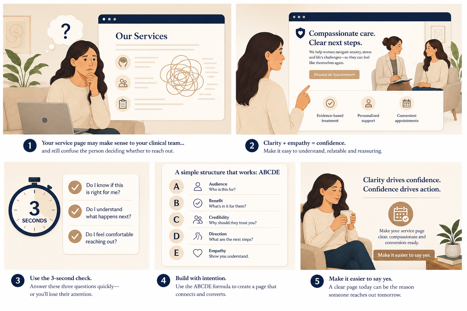
Have you ever looked at one of your service pages and thought, “This explains what we do,” but still wondered why more visitors are not reaching out?
The page may be accurate. It may describe the service correctly. It may include the right clinical terms, conditions, specialties, and credentials.
But accuracy is not always the same as clarity.
The test is simple: can a potential client understand who the service is for, what kind of problem it helps with, and what to do next without having to translate clinical language?
The hidden website issue
Why this matters
Many practice owners do not have a traffic problem first. They have a clarity problem.
A person may find your website, land on a service page, skim the first few sections, and still leave because they are not sure whether the page is speaking to them.
That does not mean the page is bad.
It may mean the page was written from the practice’s point of view instead of the visitor’s point of view.
This is common in therapy and healthcare-adjacent practices. Owners often know their services so well that they forget how much the visitor is trying to figure out in the moment.
They may be wondering:
- Is this the right kind of help for what I am dealing with?
- Do they work with people like me?
- Will I feel comfortable reaching out?
- What happens after I contact them?
- Do they have openings, fees, or next steps I can understand?
One useful data point
The SimplePractice Annual State of Private Practice Report found that 43% of providers reported receiving 0 hours of formal business training. That matters because writing a clear service page is not usually something clinicians were taught to do.
So if your service page feels hard to write, that does not mean you are doing something wrong.
It means you may need a simpler way to check whether the page is helping the reader make sense of the next step.
The common mistake
A service page can be accurate and still unclear
A page can explain the service correctly without helping a potential client recognize themselves.
This often happens when the page uses language that makes sense to the clinician, but not to the person searching for help.
For example, a service page might say:
“We provide evidence-based therapy for anxiety disorders, including generalized anxiety disorder, panic disorder, and adjustment-related concerns.”
That sentence may be clinically appropriate.
But the person reading it may be thinking:
“I cannot turn my brain off at night. I keep imagining worst-case scenarios. I am functioning, but everything feels harder than it should.”
The gap between those two versions is where people can get stuck.
Your service page may be accurate. It may include the right information. It may even sound professional.
But if the reader has to work too hard to understand whether the page is about their real-life problem, they may leave before they ever reach out.
If this test shows that your service page is unclear, the issue may be bigger than one page. It may be part of your overall website messaging system — the way your site explains who you help, what you offer, and what someone should do next.
The goal is not to make your page sound less professional. The goal is to make it easier for the right person to understand it.
The tip
The Service Page Test Most Practice Owners Skip
Read one service page as if you are a potential client, not the owner of the practice.
Choose one service page this week.
Not your whole website. Not every clinician bio. Not every page that needs updating.
Just one service page.
Then ask three questions:
- Can a visitor tell who this service is for within the first few paragraphs?
- Can they recognize the real-life problem this service helps with?
- Can they see a clear next step without searching around the page?
That is the whole test.
It is simple on purpose.
Practice owners often make website reviews too big. They open every page, start rewriting everything, compare competitors, worry about search rankings, and end up overwhelmed.
This test keeps the work focused.
You are not trying to perfect the page. You are trying to see whether the page helps the right visitor feel oriented.
What to notice
Look for the places where the reader has to guess
Confusion often hides in small gaps.
A visitor may not leave because one sentence is wrong. They may leave because too many small things are unclear.
| What the page says | What the visitor may still wonder |
|---|---|
| “We offer therapy for anxiety.” | What kind of anxiety? Work stress? Panic? Social anxiety? Parenting anxiety? |
| “Our clinicians use evidence-based approaches.” | What will sessions actually feel like? |
| “Contact us to get started.” | What happens after I fill out the form? |
| “We work with adults, teens, and families.” | Which clinician or service is the best fit for my situation? |
The fix is usually not to add more and more text.
The fix is to make the most important parts clearer.
That may mean adding a short “This may be a good fit if…” section. It may mean rewriting the first paragraph in client language. It may mean moving the next step higher on the page.
The best improvement is usually the one that reduces uncertainty for the reader.
Mini example
What this looks like in a practice
Imagine a group practice has a page for couples therapy.
The page lists clinician credentials, therapy approaches, and common concerns.
But the opening paragraph is broad:
Before: “Our experienced therapists provide couples counseling for communication issues, conflict, intimacy concerns, and relationship distress.”
Nothing is wrong with that sentence.
But it may not help the reader feel recognized.
A clearer version could sound like this:
After: “Couples often reach out when the same argument keeps repeating, small conversations turn tense quickly, or one partner feels like they are trying harder than the other. Couples therapy can help you slow down the pattern and understand what keeps getting missed.”
This version is still calm. It does not promise a result. It does not pressure anyone.
It simply helps the reader connect the service to a real situation they may recognize.
Then the page can make the next step clearer:
Clear next step: “To ask about couples therapy, complete the contact form. Our intake coordinator will reply with current availability, fees, and next steps for scheduling a consultation.”
That kind of clarity helps the visitor understand what to do next without guessing.
Quick check
Try this on one service page this week
Pick one page and answer honestly.
A visitor can tell who this service is for within the first few paragraphs.
The page uses real-life language, not only clinical terms.
The page explains what kind of concerns, situations, or questions may lead someone to this service.
The next step is easy to find without scrolling back and forth.
The page explains what happens after someone reaches out.
If you cannot check most of these boxes, do not panic.
You do not need to rewrite your whole website today.
Start with one service page. Rewrite the opening paragraph so the right person can recognize their situation. Add one clear next step. Remove one phrase that sounds professional but does not help the reader decide.
Then read it again from the client’s point of view.
A clearer service page does not have to be flashy. It just has to help the right person understand, “This might be the right place to start.”
Want help seeing where your service pages may be creating confusion? A simple outside review can show which page needs clarity first.
Related Reading
If your service pages feel accurate but still may not be helping visitors take action, read these next: