The page most therapy practices forget to update
A therapy website can look polished and still lose trust if one practical page is out of date.
Have you ever updated your homepage, refreshed a few photos, changed a headline, and felt like your website was finally in better shape?
That work matters.
But sometimes the page creating the most hesitation is not the homepage.
It is the page visitors check when they are almost ready to reach out.
The page most therapy practices forget to update is often the one with the practical details: fees, insurance, availability, services, or intake steps.
The quiet website problem
Why this matters
New client inquiries often slow down when people cannot confirm the basic details they need to feel ready.
Most practice owners look at their website through the big pages first.
The homepage. The about page. The clinician bios. The service pages.
Those pages are important. They help people understand who you help, what you offer, and whether the practice feels like a possible fit.
But when someone is close to reaching out, their questions often become much more practical.
They may be wondering:
- Are you accepting new clients?
- Do you take my insurance?
- What does a session cost?
- Do you still offer this service?
- Can I book online, or do I need to call?
- What happens after I submit the form?
If those answers are missing, outdated, or scattered across the site, the visitor has to do more work.
And when someone is already stressed, overwhelmed, or unsure about starting therapy, extra work can become a reason to pause.
A polished website builds interest. Clear practical details help people take the next step.
This is not about making the website perfect.
It is about removing small moments of doubt that could stop a right-fit person from reaching out.
The page to check
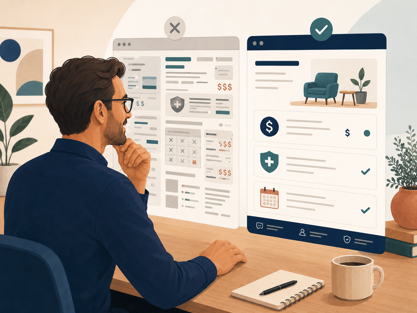
The page that gets stale first
The most forgotten page is usually the page with the practical details.
For many therapy practices, that means the fees page, insurance page, availability page, services page, or intake page.
An outdated page can create hesitation even when the rest of the website looks polished. The full therapy website strategy guide explains why practical details like fees, insurance, availability, services, and intake steps matter for new client inquiries.
These pages often start out accurate.
Then the practice changes.
A clinician fills up. A new clinician joins. A service is paused. A fee changes. An insurance panel closes. A waitlist opens. A group is no longer running. The owner changes how consult calls are handled.
But the website does not always change with the practice.
That gap is easy to miss from inside the business because the team knows what is current.
Website visitors do not.
A common pattern
The practice updates internal processes first. Then the admin team adjusts. Then clinicians learn the change. But the website stays one version behind.
This can create mixed messages.
The homepage says the practice is accepting new clients, but the availability page has not been touched in months.
The services page lists a specialty that no clinician currently offers.
The fees page says insurance information will be discussed during intake, but the practice now has a clearer insurance policy.
The contact page says someone will respond within two business days, but the team now tries to reply the same day.
None of these issues are dramatic on their own.
But together, they can make the practice feel less clear than it really is.
The tip
Run a “still true?” check on one practical page this week
Do not review the whole website. Pick one page and ask one question: “Is this still true?”
That is the whole task.
Choose the page most likely to affect a new client’s next step.
For most therapy practices, start with one of these:
- Fees and insurance
- Availability
- Services
- Intake or getting started
- Contact
Then read the page as if you were a new visitor who knows nothing about the practice.
Do not edit for style first.
Do not rewrite every sentence.
Do not open a full website redesign project.
Just look for anything that may be outdated, unclear, or no longer useful.
This week’s simple action
Open one practical page on your website and highlight every sentence that may no longer be fully accurate. Update only those details first.
Look especially for details that affect someone’s decision to reach out.
-
Availability
Does the page make it clear whether the practice is accepting new clients, has limited openings, or has certain clinicians available?
-
Fees
Are session fees, consult fees, or payment expectations accurate enough that a visitor is not surprised later?
-
Insurance
Does the page clearly explain what insurance the practice accepts, does not accept, or can provide documentation for?
-
Services
Are all listed services still active, available, and easy to understand?
-
Next step
Does the page clearly tell people what to do next?
This is a small task, but it can make the whole website feel more trustworthy.
Current details help people feel oriented.
Clear next steps help people move forward.
And fewer surprises during intake can save time for both the visitor and the practice team.
Example
What this looks like in a practice
Imagine a group therapy practice that has grown quickly over the last year.
The website still looks good.
The homepage is warm. The photos are current. The clinician bios are mostly accurate.
But the fees and insurance page has not been updated in nine months.
It still says the practice has evening availability, even though evening spots are mostly full.
It lists an insurance plan the practice is no longer accepting for new clients.
It says “contact us to learn more about fees,” even though the practice now has a clear fee structure.
It links to a service that is currently paused because the clinician who offered it is on leave.
From inside the practice, everyone knows what is current.
The admin team knows what to say. The owner knows which clinicians have space. The clinicians know which services are active.
But a website visitor does not have that context.
They only see the page in front of them.
When practical details are outdated, the visitor may not know whether the practice is a fit anymore.
The fix does not need to be complicated.
The practice could update the page with a few clear sentences:
Simple copy update
“We currently have daytime openings for adults and teens. Evening appointments are limited. Our current session fee is listed below. We are in network with [insurance plans], and we can provide superbills for out-of-network reimbursement when appropriate. To get started, complete the inquiry form and our intake coordinator will follow up with the next step.”
That one update does a lot.
It clarifies availability.
It reduces fee confusion.
It sets expectations around insurance.
It gives the visitor a clearer next step.
And it helps the practice avoid spending intake time correcting outdated website information.
Quick check
Which page should you review first?
Pick the answer that feels most true right now.
Our fees or insurance information may not be fully clear.
Our availability has changed, but I am not sure the website reflects it.
We still list services we do not actively offer or prioritize.
Our intake steps are clear to the team, but probably not clear to a new visitor.
I am not sure which page is outdated, but I know the website has not been reviewed in a while.
Any of these answers gives you a useful place to start.
You do not need to fix the full website this week.
Choose one page.
Ask, “Is this still true?”
Update the details that could affect a new client’s decision to reach out.
Then stop.
A website does not need to say everything. But the practical details should help the right person understand whether the practice is a fit and what to do next.
Want help spotting the pages where website visitors may be hesitating? A simple outside review can make the next practical update easier to see.
Related Reading
If website visitors keep asking questions your site should already answer, these may help: