Therapist Website Examples: What Practice Owners Should Actually Notice
When you look at therapist website examples, do not start by asking, “Do I like this design?” Start by asking, “Does this make the next step easier for the right client?”
Have you ever searched for therapist website examples and ended up with a page full of beautiful screenshots?
Soft colors. Calm photos. Nice fonts. Clean layouts. Maybe a few websites that look expensive or polished.
Those things matter. A messy or outdated website can make a practice feel less trustworthy. But design style is only one part of the decision.
A therapy practice website has a harder job than looking good. It has to help a nervous, busy, uncertain person understand whether this practice may be a fit and what to do next.
That is where many practice owners get stuck.
The useful question is not, “Which therapist website looks best?” It is, “Which website makes it easiest for a right-fit client to understand, trust, and take the next step?”
The common mistake
Website examples can make you focus on the wrong thing
Most practice owners look at examples for inspiration. But inspiration can turn into comparison very quickly.
You see another therapist’s homepage and wonder whether your colors are too plain. You see a group practice with beautiful photography and wonder whether your site needs new photos. You notice a clever headline and wonder whether your own words sound too simple.
Some of those questions may be useful.
But they are not the first questions.
A therapy website is not only a brand asset. It is part of the client’s path from searching to reaching out. That path includes confusion, hesitation, cost questions, timing questions, privacy concerns, and the quiet fear of choosing the wrong provider.
One useful data point
Nielsen Norman Group has reported that users often leave web pages in 10 to 20 seconds. A clear value proposition can help people stay longer, but the first few seconds matter.
For therapy practices, those first few seconds are not about pressure. They are about orientation.
Can the visitor quickly tell where they are? Can they tell who the practice helps? Can they find the service that matches their concern? Can they see the next step without hunting for it?
Those questions matter more than whether you personally like the color palette.
Another useful data point
Press Ganey reported that 80% of healthcare consumers say online scheduling influences their choice of provider, and nearly a quarter may walk away if booking does not feel easy. For therapy practices, this is a reminder that the website should not only look calm. It should make the next step clear, simple, and easy to follow.
The better lens
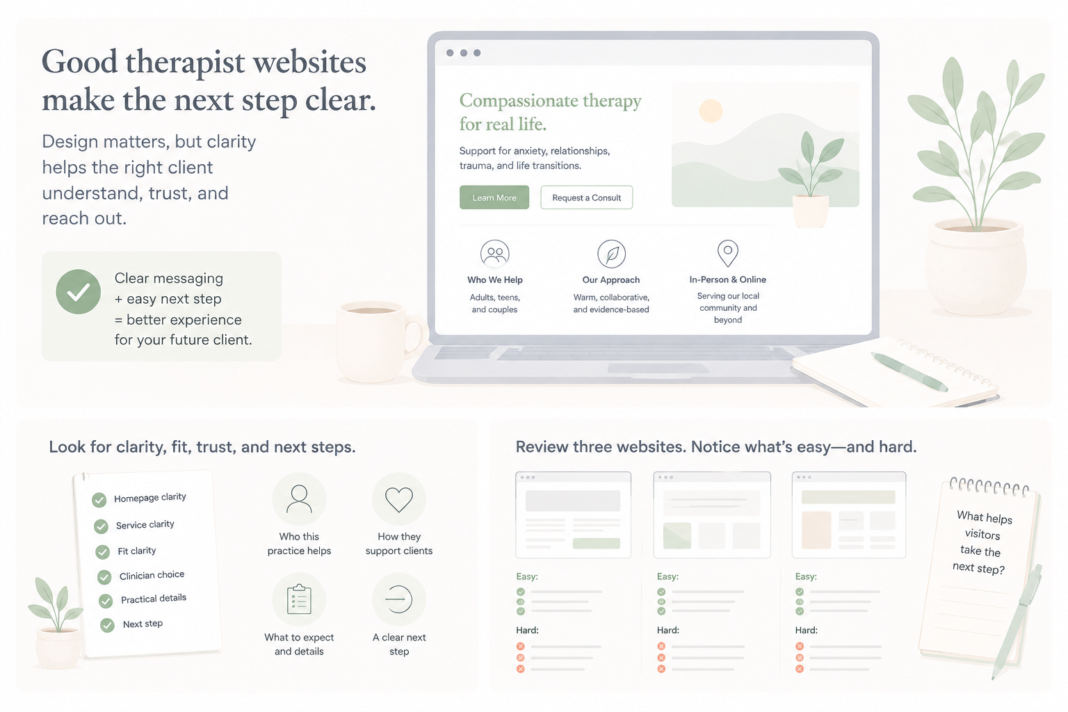
Look for clarity, fit, trust, and next steps
When reviewing therapist website examples, look at what the website makes easy or hard for the visitor.
That means looking past taste.
A website can be calm but unclear. It can be beautiful but vague. It can sound warm but still leave a visitor wondering whether the practice works with their concern, accepts their payment type, has openings, or serves their location.
Start with six things.
| What to notice | Question to ask |
|---|---|
| Homepage clarity | Can I tell who this practice helps within a few seconds? |
| Service clarity | Can I understand what each service is for without knowing clinical terms? |
| Fit clarity | Can I tell whether this practice is likely a good fit for my situation? |
| Clinician choice | Do the bios help me choose, or do they all sound similar? |
| Practical details | Can I find fees, insurance, location, telehealth, availability, or intake basics? |
| Next step | Do I know exactly what to do after I decide I am interested? |
This is the same kind of clarity that matters in your own therapy website strategy. A polished site still needs to help people move from confusion to a clearer inquiry.
It also connects to smaller pages that often get overlooked, like the homepage, service pages, contact page, and intake path.
The practical tip
Review three therapist websites and write down what each one makes easy or hard
Before you redesign anything, study three examples like a potential client would.
Choose three therapist or group practice websites. They can be local practices, practices in another city, or examples you found while searching.
Do not spend an hour on each one.
Give each site two passes.
- First pass: look at the homepage for 10 to 20 seconds. Write down what you understood right away.
- Second pass: try to act like a visitor with a real concern. Find the service, check fit, look for cost or insurance basics, and find the next step.
Then write two simple lists for each site.
What this website made easy:
“I could tell they help teens with anxiety. The contact button was visible. The service page explained what therapy might help with in plain language.”
What this website made hard:
“I could not tell whether they accept insurance. I did not know which clinician works with teens. The contact form did not explain when someone would reply.”
That is the whole exercise.
You are not ranking the websites. You are training your eye.
You are noticing what helps a person feel oriented and what forces them to guess.
What good looks like
A useful therapist website feels easy to understand
The best therapist website examples are not always the fanciest ones. They are the ones that reduce uncertainty.
A clear homepage does not try to explain everything at once. It helps the right visitor understand who the practice helps and where to go next. This is why a simple homepage clarity check can reveal more than another round of design edits.
A clear service page does not only list “anxiety, depression, trauma, and life transitions.” It explains what those concerns may look like in real life, who the service is for, and what someone can expect from reaching out. If your service pages feel vague, this article on whether your therapy website is helping clients choose is a useful companion.
A clear contact path does not make people hunt. It gives a visible next step, explains what happens after someone reaches out, and helps the visitor understand whether they should call, submit a form, request a consult, or book online. Your contact page is part of the intake process, not just a place to put a form.
A clear website also respects the emotional state of the visitor.
Someone looking for therapy may be tired. They may be comparing several practices. They may not know the right clinical words. They may be worried about cost. They may be embarrassed to reach out. They may be looking on their phone between work, parenting, school pickup, or another appointment.
Good website clarity makes that moment easier.
Example
A group practice reviews three websites
A group practice owner wants a better website, so she starts by looking at examples.
At first, she notices the usual things.
One site has better photos. One has softer colors. One has a homepage that feels more modern.
But then she uses the three-website review.
She notices something more useful.
- One website makes it very easy to tell who the practice helps, but the fees are hard to find.
- One website has beautiful clinician bios, but they do not help a client choose between therapists.
- One website has plain design, but the contact path is extremely clear.
Now she has better questions for her own site.
Not “Should we change our colors?”
But:
- Can a visitor tell which clients we serve best?
- Can someone find the right service without reading every page?
- Do our bios help people choose, especially when we have clinician openings?
- Do we explain fees and insurance early enough?
- Do we make the next step obvious from every important page?
Those questions are more useful than copying another practice’s design.
They point to the real website bottleneck.
Quick check
What do you notice first when you look at therapist website examples?
Which answer is closest?
I mostly notice design, colors, photos, and layout.
I notice whether the homepage clearly says who the practice helps.
I notice whether the services are easy to understand.
I notice whether I can find fees, insurance, availability, and next steps.
I am not sure what I should be looking for.
If your answer is A or E, that is common.
Most website example posts train practice owners to notice appearance first.
This week, try a different review.
Open three therapist websites on your phone. For each one, write down what the site makes easy and what it makes hard within the first few seconds.
Then open your own website and do the same thing.
Do not redesign everything. Do not rewrite every page. Just notice the pattern.
Your next useful website improvement may be a clearer headline, a more specific service page, a stronger clinician bio, a visible contact button, or one sentence explaining what happens after someone reaches out.
And if you want a more structured way to review your own site, try the free Therapy Practice Website Scanner.
Good therapist website examples are not just nice to look at. They show you whether the path from first visit to inquiry feels clear, calm, and easy to follow.