Your website’s next step may be too hard to find
A therapy practice website can look professional and still lose potential clients if the next step is too hard to find.
Have you ever looked at your practice website and thought, “It looks good. Why aren’t more people reaching out?”
That is a frustrating place to be.
The photos are professional. The colors feel calm. The copy sounds warm. The pages are organized. Nothing looks obviously broken.
But a website can look polished and still make the next step too hard to find.
The better first question is not, “Does the website look good?” It is, “Can a nervous visitor tell what to do next within 10 seconds?”
Contents
The hidden leak
The polished website problem
A common website problem is not that the site is bad. It is that the next step is hidden, vague, or buried.
This can happen even on a beautiful site.
The “Contact” button may be tucked into a menu. The homepage may have several buttons that all compete with each other. The first screen may explain the practice, but not what to do next. The mobile version may push the button so far down the page that a visitor has to scroll, read, decide, and search before they can act.
That may not sound like a big issue.
But for a nervous potential client, every extra bit of effort can create hesitation.
- “Do I call or fill out the form?”
- “Can I schedule online?”
- “Will someone call me back?”
- “Do they have openings?”
- “Is this the right place for me?”
- “What happens after I reach out?”
When those questions are not answered quickly, people do not always stop because they are not interested. Sometimes they stop because the path feels unclear.
The owner knows where the contact page is. The website visitor does not.
The missed context
Why mobile changes the experience
Many practice owners review their websites on a laptop, but potential clients are often looking from a phone.
The mobile experience can feel very different.
A homepage may look clean on desktop but crowded on mobile. A button that is obvious on a wide screen may disappear into a collapsed menu. A warm introduction may take up the whole first screen before the visitor sees how to contact you.
Most potential clients are not reading your website like a practice owner would. They may be tired, anxious, distracted, or overwhelmed. They may be comparing several practices. They may be trying to help their child, partner, parent, or themselves.
Your website does not only need to explain your practice. It needs to help the person take the next small step.
The practical tip
The 10-second next-step check
Open your homepage on your phone and ask one question: can a new visitor tell what to do next within 10 seconds?
Do not audit the whole website.
Do not rewrite every page.
Do not open analytics.
Do not compare your site to five other practices.
Just open the homepage on mobile and look at the first screen.
- What is the first action I am asking someone to take?
- Can they see that action without working for it?
- Is the button language clear?
- Does the page explain what happens after they click?
That is enough for this week.
Your next best website fix may be smaller than a redesign.
What to improve
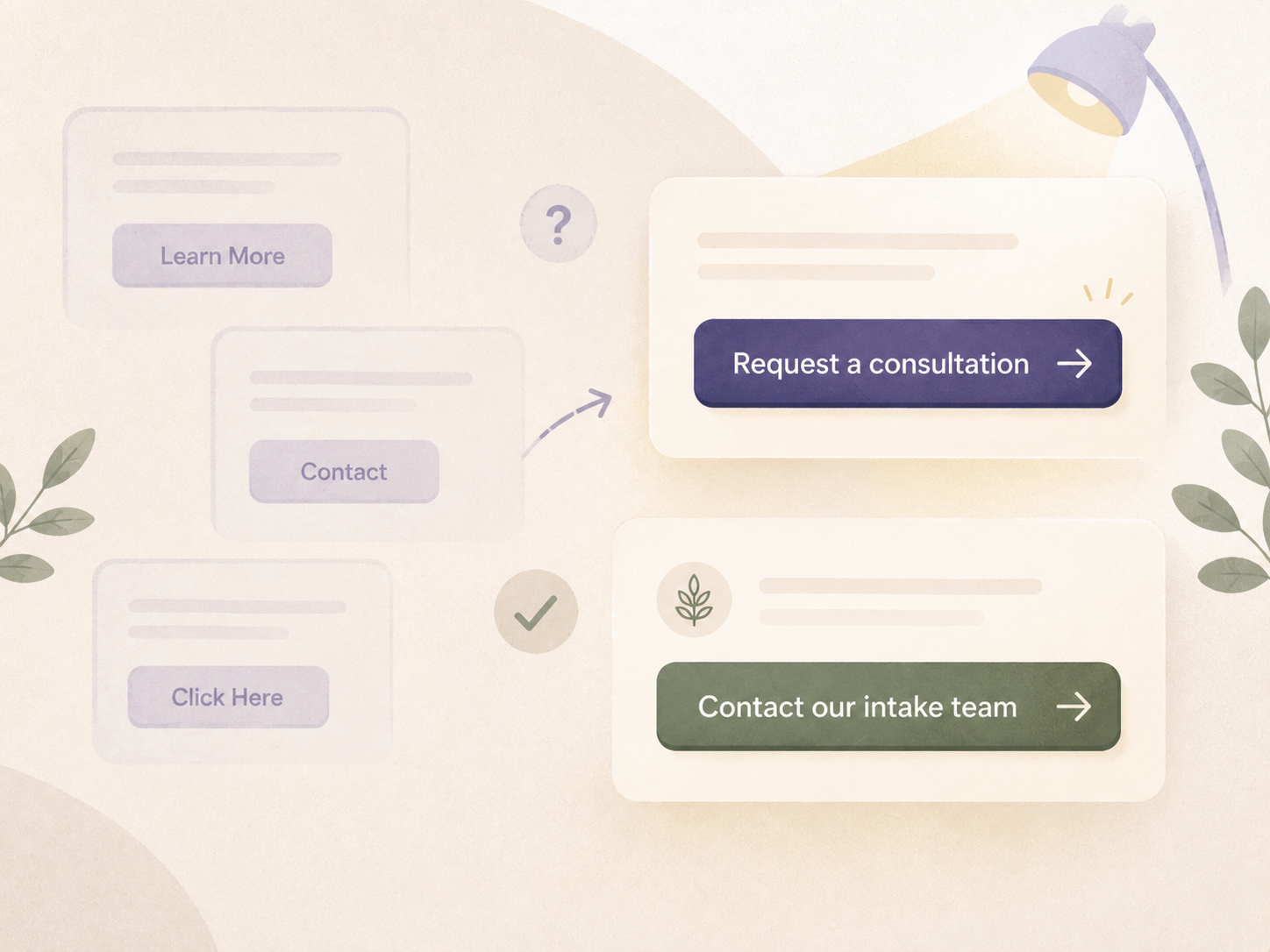
What counts as a clear next step?
A clear next step does not need to be aggressive.
It does not need to say “Book Now” if that does not fit your intake process.
For many therapy practices, a clear next step might be:
- Request a consultation
- Start with a short inquiry form
- Check current availability
- Contact our intake team
- Find the right clinician
- Schedule a free 15-minute call
The wording depends on your actual process.
The important thing is that the visitor should not have to guess.
| Instead of | Try |
|---|---|
| Get Started | Request a consultation |
| Contact | Contact our intake team |
| Book Now | Request an appointment, if appointments are not automatically confirmed |
| Learn More | See if we are a good fit |
Small wording changes can lower pressure and make the next step feel safer.
The goal is not to push someone into therapy. The goal is to reduce confusion for someone who is already considering reaching out.
Go deeper
A clear button is only one part of the website path. For the bigger picture, read Therapy website strategy: why visitors do not become inquiries and see how service pages, clinician bios, fees, intake, and follow-up all work together.
Example
A practice example
Imagine a group therapy practice with five clinicians.
The owner feels confused because the website gets compliments. Referral partners say it looks professional. The homepage has warm copy, a nice team photo, and a list of services.
But new client inquiries are still lower than expected.
The owner opens the homepage on mobile.
Here is what they notice
- The first screen shows the logo, navigation menu, a large image, and a sentence about compassionate therapy.
- The contact button is inside the mobile menu.
- The main button says “Learn More.”
- The page does not mention what happens after someone reaches out.
The owner realizes the site is not broken. It is just asking a nervous visitor to do too much work.
So the owner makes one small change.
They update the first screen so it includes one clear button:
Request a consultation
Under the button, they add one simple sentence:
“Tell us what you are looking for, and our intake team will help match you with the best-fit clinician.”
That is not a full website redesign.
It is not a new marketing campaign.
It is one clearer next step.
Quick check
Open your homepage on mobile
If you were a nervous potential client, would you know what to do next within 10 seconds?
-
A
Yes, the next step is clear right away.
-
B
Sort of, but I have to scroll or think about it.
-
C
No, the next step is hidden in the menu or lower on the page.
-
D
There are several next steps, and I am not sure which one matters most.
If your answer is B, C, or D, that does not mean your website is failing.
It means there may be one simple place to improve before you spend more time trying to get more visitors.
Try checking this once this week.
Your next best growth fix may not be more marketing. It may be making the next step easier to see.
Free resources
Want to check this without turning it into a full redesign project? These two free tools can help you spot where visitors may be hesitating.
Want help finding where your website may be losing good-fit inquiries? A simple outside look can make the next step clearer.
Need help with your website? Click hereRelated Reading
If your website looks good but visitors may still be hesitating, read these next: