Are website visitors reaching your contact page?
The better question is not only whether people visit your therapy practice website. It is whether they reach the page where they can actually contact you.
62.7% of clinicians in the SimplePractice dataset used online appointment requests. But a digital next step only helps when visitors can find it.
Have you ever looked at your website traffic and thought, “People are visiting the site, so why are we not getting more inquiries?”
That can be a confusing place to be.
The website may look professional. The homepage may be getting visits. A few service pages may even be getting steady traffic.
But traffic by itself does not tell you whether people are moving toward the next step.
A potential client may visit your homepage, skim a service page, feel interested, and still leave before they ever find the contact page, scheduling button, or form.
One of the most useful website checks is simple: are visitors reaching the page where they can actually contact you?
The problem
Traffic is not the same as a clear path.
Many practice owners check website traffic because it is easy to see.
Traffic went up. That feels good.
Traffic went down. That feels concerning.
But website traffic is only the first part of the story.
A visitor still has to understand who you help, see a concern or service that fits their situation, trust that the practice may be a good next step, and find a clear way to reach out.
That is a lot to ask from one website visit, especially when the person may be anxious, overwhelmed, or searching quickly on their phone.
This is where hidden website bottlenecks show up.
The contact button may be visible on desktop but buried on mobile.
The service page may explain the therapy approach but not show what to do next.
The contact page may exist, but only be linked in the footer.
The scheduling button may say “Get started,” but visitors may not know whether that means a free consult, a paid intake, a phone call, or a full appointment request.
Nothing is technically broken. But the path is still unclear.
43% of providers reported receiving no formal business training. So if you have never been taught to read website behavior this way, that is not a personal failure.
The tip
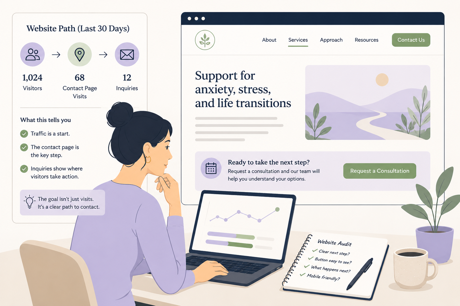
Check one simple website path from the last 30 days.
This week, compare three numbers:
How many people visited the website?
How many people visited the contact page, scheduling page, or appointment request page?
How many people submitted a form, clicked to call, requested a consult, or scheduled?
You do not need a complicated dashboard.
You are looking for a basic pattern.
If many people visit the homepage but very few reach a service page, the homepage may not be guiding them clearly.
If many people visit service pages but few reach the contact page, the service pages may need a stronger next step.
If many people visit the contact page but few submit the form, the contact page may feel unclear, too long, too vague, or too risky.
That last point matters.
A contact page is not just a technical page. It is part of the intake experience.
Before someone fills out a form, they may be wondering: Will anyone reply? What happens after I submit this? Do you take my insurance? Can I choose a therapist? Is this a consultation or a full intake? Am I about to share too much personal information?
A clearer page can reduce that uncertainty.
Example
What this can reveal in a real practice.
Imagine a group therapy practice that gets 900 website visits in the last 30 days.
At first, that sounds encouraging.
900 website visits
310 service page visits
38 contact page visits
7 form submissions
3 scheduled consults
The issue may not be traffic.
The practice is getting visitors. Some are even showing interest in service pages.
But only a small number are reaching the contact page.
That tells the owner where to look first.
Instead of rewriting the whole website or spending more on ads, they can open the top three service pages and ask:
Is there a clear contact button near the top?
Is there another next step after the first few paragraphs?
Does the page explain what happens after someone reaches out?
Does the mobile version make the button easy to see?
Do we use clear words like “Request a consultation” instead of vague words like “Begin your journey”?
A small change may be enough to test.
For example, the practice might add a short next-step box near the top of each service page:
“Interested in working with us? Request a consultation and our intake coordinator will help you understand availability, fit, fees, and next steps.”
That is not pushy.
It simply helps a right-fit visitor know what to do.
Simple audit
Test the contact path like a nervous visitor would.
Open your website on your phone. Pretend you are a potential client who is nervous, busy, and not sure whether therapy is the right next step.
Start on the homepage.
Then ask:
Can I tell who this practice helps within 10 seconds?
Can I find a service page that matches my concern?
Can I see a clear next step without scrolling too much?
Can I tell what happens after I reach out?
Can I contact the practice from every important page?
Now ask one person who does not work in your practice to try the same thing.
Give them one task:
“Find the page where you would contact us if you wanted to ask about therapy.”
Watch where they pause.
That pause is useful.
It may show you where the website feels clear to you because you already know how it works, but not clear to a new visitor.
Quick check
Are visitors reaching the contact path?
Look at your website data from the last 30 days. Which answer is closest?
Many visitors reach the contact or scheduling page.
Some visitors reach it, but fewer than expected.
Very few visitors reach it.
I do not know how to check.
If your answer is C or D, do not start by redesigning the whole website.
Start smaller.
Pick one high-traffic page and make the next step clearer.
That might mean adding a contact button near the top, explaining what happens after someone reaches out, adding a short “not sure who to contact?” line, or making the mobile button easier to find.
More traffic can help a practice grow.
But only if the website gives right-fit visitors a clear path forward.
Try checking the path once this week: visits, contact page visits, and inquiries.
Your next website improvement may be hiding between the page people visit and the page where they can finally reach you.
Want help finding where your website path is getting stuck? Start with the free Therapy Practice Website Scanner.