Before/After: A More Specific Website Analytics Review for Therapy Practices
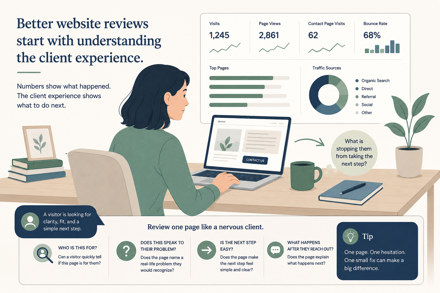
Your website analytics may be telling you less than you think.
Have you ever looked at your website numbers and thought, “Okay… but what am I supposed to do with this?”
Many therapy practice owners know they should check their website analytics. They may glance at visits, page views, traffic sources, or contact page activity. But the numbers often feel disconnected from the real question:
Are the right people reaching out, or are they leaving because something feels unclear?
That is a different kind of website review.
A Tebra survey found that 44% of patients say a practice website influences their decision when choosing a provider. So your website review cannot stop at visits and page views. It needs to ask what a real person understands, trusts, and feels ready to do next.
And website friction matters. Google has reported that 53% of visits are likely to be abandoned if mobile pages take longer than three seconds to load. Speed is only one kind of friction. Confusing wording, vague service pages, hidden contact buttons, and unclear next steps can create the same feeling: “I am not sure this is for me.”
The goal is not to become a data expert. The goal is to notice where a real person may hesitate before reaching out.
The problem: most website reviews stay too vague
A common website analytics review sounds like this:
“Your homepage had 900 visits this month. Your anxiety therapy page had 180 visits. Your contact page had 42 visits. Your bounce rate was high, so we recommend improving the website copy and adding clearer calls to action.”
That may be technically true. But for a busy practice owner, it is hard to act on.
What copy should be improved? Which page matters first? What does “clearer call to action” actually mean? Is the problem visibility, fit, trust, the contact process, mobile experience, or something else?
When a review stays vague, the owner often jumps to a bigger fix than they need. They consider a redesign. They post more. They change their homepage again. They ask for more traffic.
But the issue may be much smaller.
The website may be getting enough visitors. The problem may be that those visitors do not see themselves clearly enough on the page, or they do not know what happens after they reach out.
The tip: review one page like a nervous client, not like a marketer
This week, choose one high-value page on your website. Start with your homepage, your most viewed service page, or your contact page.
Then look at the page through four simple questions:
- Can a visitor quickly tell who this page is for?
- Does the page name a real-life problem they would recognize?
- Does the page make the next step feel easy?
- Does the page explain what happens after they reach out?
That is a more useful analytics review because it connects the numbers to the client’s experience.
If your anxiety therapy page has steady visits but very few people continue to your contact page, the first question is not “How do we get more traffic?”
The better question is, “What might someone still be unsure about after reading this page?”
Before and after: a more specific website analytics review
Here is a simple example you can adapt for your own practice.
Website analytics review
Your anxiety therapy page is receiving traffic, but not many people are converting. Consider improving the copy, adding stronger CTAs, and making the page more engaging for potential clients.
Website analytics review
Your anxiety therapy page is one of the most viewed pages on the site, but only a small number of visitors continue to the contact page. This suggests the page may be getting attention, but not giving enough confidence to take the next step.
The page currently describes anxiety in broad clinical language. A visitor may understand that you treat anxiety, but still wonder, “Is this the kind of anxiety I am dealing with?”
Try adding a short section near the top that names the real-life situations your right-fit clients often recognize, such as constant overthinking, trouble sleeping, panic before work, avoiding decisions, or feeling unable to relax even when life looks fine from the outside.
Then make the next step easier by adding one clear line above the contact button: “Reach out to ask about current availability. Our team will reply with next steps and help you decide whether this is a fit.”
Notice the difference.
The stronger version does not shame the practice. It does not use pressure. It does not promise that one copy edit will fill the caseload.
It simply makes the likely hesitation easier to see.
What changed in the stronger version?
1. The audience became clearer
The weak version says “potential clients.” That is broad.
The stronger version points to people looking for anxiety therapy and asks whether they can recognize themselves on the page. That matters because a visitor may not think in diagnostic language. They may think, “I cannot sleep,” “I keep spiraling,” or “I am tired of feeling on edge.”
2. The problem became easier to understand
The weak version says the page is “not converting.” That may be true, but it sounds like a marketing problem.
The stronger version says the page is getting attention, but may not be creating enough confidence. That is easier for a practice owner to understand and easier to fix.
3. The recommendation became smaller and more useful
“Improve the copy” is not a next step.
“Add a short section near the top that names real-life situations” is a next step.
That kind of recommendation helps the owner make progress without rewriting the entire website.
4. The contact step became less risky
Many visitors hesitate because they do not know what happens after they reach out.
Will they be pressured to book? Will they get a call? Will they have to share too much? Will they find out later that the practice is full or out of network?
A simple sentence can lower that friction:
That line does not overpromise. It simply makes the next step feel safer.
A copy-paste framework for your next review
Use this simple structure the next time you review one page in your analytics:
Page reviewed: [Name of page]
What the numbers show: This page is receiving [steady / low / high] traffic, but [few visitors continue to the contact page / many visitors leave quickly / inquiries from this page are unclear].
What a visitor may be wondering: “[Plain-English question a right-fit client might have]”
One likely source of hesitation: The page may not clearly explain [who this is for / what problem you help with / what happens next / fees or availability / how to choose a clinician].
One small fix to test: Add [one section, one sentence, one button, one explanation, or one example] near [top of page / contact section / clinician bio / service description].
Keep it simple. One page. One hesitation. One fix.
Important note: adapt any copy to your niche, licensure, ethics, scope of practice, and actual client experience. Do not imply guaranteed outcomes or make claims that are not accurate for your practice.
Quick check
Open one page on your website and ask:
If I were a tired, unsure, right-fit client reading this page on my phone, what would I still need to know before reaching out?
Write down one answer. Then make one small change that answers it.
That may be a clearer sentence near the top of the page. It may be a short “what happens next” section. It may be a button that says “Ask about availability” instead of a vague “Contact.”
You do not need to fix the whole website this week.
You only need to make one important page easier to act on.
Related reading
If you want to keep going, these are good next reads:
- Are you sure you need more marketing?
- Therapy Website Metrics: 6 Numbers to Check Each Month
- Is Psychology Today Still Working for Therapists?
You can also use the Practice Growth Leak Map or the Website Clarity Checklist to spot where visitors may be getting stuck before they inquire.
Closing thought
Website analytics are most useful when they help you understand people, not just numbers.
When a visitor leaves without contacting your practice, it does not always mean they were not interested. Sometimes it means they did not feel clear enough to take the next step.
Start there.
