Website Visitors but Not Enough Therapy Inquiries? Check This First
Getting website visitors is only useful if the right people can quickly understand fit, trust the next step, and feel clear enough to reach out.
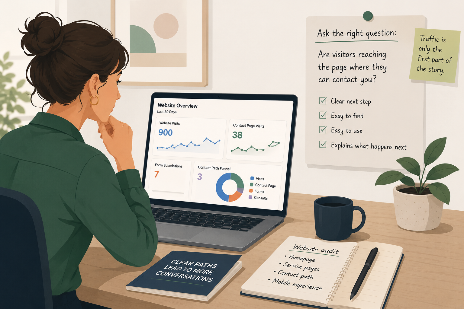
Have you ever looked at your website traffic and thought, “People are visiting, so why are more of them not reaching out?”
This can feel especially frustrating when the rest of the practice looks healthy. You have a professional website. You have good clinicians. You may even have openings. But the inquiry form is quiet, the phone is not ringing enough, or the people who do reach out are not quite the right fit.
Before you ask for more traffic, check whether one important page is giving visitors a clear enough reason to take the next step.
Why this matters
Traffic does not always mean clarity
The demand for care is real. HRSA reported that 40% of the U.S. population, about 137 million people, lived in a Mental Health Professional Shortage Area as of December 2, 2025.
So sometimes the problem is not that no one needs help.
Sometimes the problem is that the person who lands on your website does not feel clear enough to take the next step.
A person can need support, like your practice, and still leave your website if the path forward feels unclear.
The problem
Your page may be asking visitors to work too hard
Website traffic only tells you that someone arrived.
It does not tell you whether they understood who you help. It does not tell you whether they found the right service. It does not tell you whether they trusted the next step enough to contact you.
A practice website can look warm, polished, and professional but still leave visitors unsure.
Questions visitors may be asking
“Is this practice right for my situation?”
“Do they work with people like me?”
“What happens after I fill out the form?”
“Are they accepting new clients?”
“Will they take my insurance?”
“Am I going to have to explain everything before I even know if this is a fit?”
These questions matter because many people do not read a therapy website slowly. They scan it. They may be anxious, overwhelmed, comparing several providers, or trying to find help during a short break in the day.
If the page asks them to do too much work, they may leave.
Not because they are not interested.
Because the next step does not feel clear enough yet.
The tip
Review one high-traffic page for three things
Pick one page and check for clear fit, clear next step, and reduced hesitation.
Do not start by redesigning the whole website.
Do not rewrite every page.
Do not assume the homepage is the only problem.
Choose one page that already gets attention. This could be your homepage, your most visited service page, a clinician bio, or a location page. Then open it on your phone and look at it the way a potential client might.
- Clear fit: Can a visitor tell who this page is for?
- Clear next step: Can they see what to do next without searching?
- Reduced hesitation: Does the page answer the question most likely to stop someone from reaching out?
A vague page often says things like “We help with anxiety, depression, trauma, and life transitions.”
That may be true, but it may not help someone recognize themselves.
Clearer language sounds more like real life:
“This page is for adults who look calm on the outside but feel constantly tense, overthinking, or unable to rest.”
“This service may be a fit for parents who are worried about their teen’s anxiety, school avoidance, or sudden mood changes.”
You are not making a clinical promise. You are helping the right person understand whether they are in the right place.
The next step should also be visible near the top of the page and repeated again lower down. Try not to rely on one small “Contact” link in the menu.
Use clear language, such as “Request a consultation,” “Ask about availability,” or “Start with a brief intake call.”
Then explain what happens after they click.
“After you reach out, our intake coordinator will review your message and help you understand whether one of our clinicians may be a good fit.”
That one sentence can reduce a lot of uncertainty.
Finally, answer the one or two questions most likely to stop a good-fit visitor. For a therapy service page, this may be fees, insurance, appointment availability, telehealth, location, clinician fit, age range, or whether the practice handles crisis needs.
You do not need to answer everything. But you should answer the question that could quietly stop someone from reaching out.
Example
What this could look like in a practice
Imagine a group practice has a page for anxiety therapy.
The page gets steady traffic, but few people contact the practice from it.
The page says the practice offers “evidence-based treatment for anxiety disorders using CBT, mindfulness, and trauma-informed care.”
That may be accurate, but it may not answer the visitor’s real question.
The owner reviews the page and makes three small changes.
At the top, they add: “Anxiety therapy for adults who feel stuck in overthinking, tension, panic, or constant worry.”
They add a visible button that says: “Ask about anxiety therapy availability.”
Under the button, they add: “After you reach out, we will ask a few basic questions, check clinician availability, and help you understand whether our practice may be a fit.”
Then they add a short section answering common questions about insurance, telehealth, and what to do in a crisis.
This is not a full website rebuild.
It is one clearer page.
And sometimes one clearer page is enough to reveal where visitors were getting stuck.
Quick check
Score one page this week
Choose one page and answer yes, no, or not sure.
Can a visitor tell who the page is for within the first few seconds?
Is the next step visible without scrolling far?
Does the page explain what happens after someone reaches out?
Does it answer the most common pre-intake question?
Would a nervous visitor feel guided, or would they need to figure things out alone?
If you answer “no” or “not sure” to more than two of these, the page may be creating hesitation.
That does not mean your website is bad.
It means one page may need a clearer path.
What to do this week
Before asking for more traffic, check the path
When a website gets visitors but not enough inquiries, it is tempting to ask for more traffic.
But before you spend more time or money getting people to the site, check whether one important page is helping them move forward.
Clear fit. Clear next step. Fewer unanswered questions.
That is a small fix worth checking this week.
Want help finding where website visitors may be getting stuck? A focused review of one key page can make the next step easier to see.