When your website gets visitors but not enough inquiries
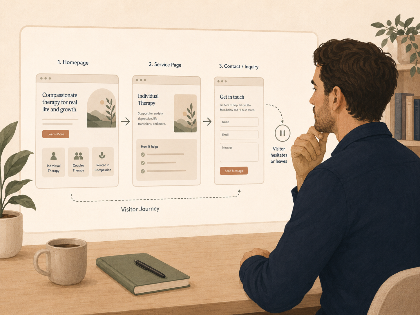
If your website is getting visitors but not enough inquiries, the first fix may not be more traffic. It may be making one important page clearer.
Have you ever looked at your website numbers and thought, “People are visiting, so why are they not reaching out?”
This is a frustrating place to be as a practice owner.
You may be getting traffic from Google, Psychology Today, referral partners, social media, your Google Business Profile, or local searches. People are landing on your homepage. They may be reading a service page. They may even be checking clinician bios.
But the inquiries are not matching the attention.
That can make you wonder if you need more marketing, a full website redesign, a new logo, a better ad campaign, or more social media content.
Sometimes, visibility is the issue.
But when your website already gets visitors and the inquiries are still too low, the problem may not be attention. It may be clarity.
Why this matters
For therapy practices, this does not mean your website needs to act like a sales page. It means your website needs to help a real person understand fit, trust the next step, and feel safe enough to reach out.
The problem
A professional-looking website can still leave people stuck.
This is one of the most common hidden bottlenecks for therapy practices.
The site may look clean. The colors may be calm. The photos may feel warm. The menu may be organized. The copy may sound compassionate.
But when a potential client lands on the page, they still may not understand whether the practice is a good fit.
Many therapy websites say some version of:
“We provide compassionate, evidence-based care for anxiety, depression, trauma, relationships, and life transitions.”
That sentence is not wrong.
It is just not very helpful by itself.
A person visiting your site may not be thinking in neat clinical categories. They may be thinking:
- “I cannot stop snapping at my partner.”
- “My teenager will not talk to me.”
- “I feel fine at work, then fall apart at night.”
- “I know I need help, but I do not want to start over with someone who does not get it.”
- “I am worried I will call and find out I cannot afford it.”
- “I do not know if this is serious enough for therapy.”
When your website stays broad, the visitor has to do the work of translating your services into their life.
Some will.
Many will not.
They may click around. They may open three tabs. They may compare your site with another practice. They may plan to come back later.
Then life interrupts.
The inquiry never happens.
This is why website traffic alone can be misleading. Traffic tells you people arrived. It does not tell you whether they felt clear enough to take the next step.
The visitor’s experience
A website visitor is usually looking for relief, not a research project.
A practice owner reads the website with inside knowledge. A potential client does not.
You know what your services mean. You know which clinician works well with which concern. You know how intake works. You know whether someone should call, submit a form, request a consult, or choose a provider.
A visitor does not know any of that yet.
They are often reading while tired, stressed, embarrassed, overwhelmed, or unsure.
They may be on their phone between meetings. They may be searching late at night. They may be helping a partner, child, parent, or friend. They may have already looked at six other sites.
So even small points of confusion can create a pause.
And on a website, a pause often becomes an exit.
The quieter questions
Your visitor may be asking: “Is this for me?” “Can they help with what I am dealing with?” “What happens if I reach out?” “Will I be embarrassed, confused, or pressured?” “Do they take my insurance?” “Is there availability?”
If the page does not answer enough of those questions, visitors may leave without doing anything.
Not because they are not interested.
Because they are unsure.
The tip
Review one high-traffic page for three things.
Clear fit. Clear next step. Reduced hesitation.
That is the whole exercise.
Not a full website audit.
Not a rebrand.
Not rewriting every service page.
Not changing every button on your site.
Pick one page that already gets attention and ask whether that page helps a visitor understand who the service is for, what to do next, and what questions might otherwise stop them from reaching out.
This is simple, but it is not always easy.
Practice owners often want to fix everything at once. The homepage. The service pages. The clinician bios. The contact page. The FAQ page. The intake form. The footer. The navigation.
That creates overwhelm.
And overwhelmed owners often delay the work.
A one-page review is more useful because it gives you a place to start.
Which page should you review first?
Start with a page that already has visitors.
That might be your homepage.
It might be your anxiety therapy page, couples therapy page, EMDR page, child therapy page, trauma therapy page, teen therapy page, medication management page, or online therapy page.
It might be a clinician bio if people are landing there from a directory or referral link.
It might even be your contact page if visitors are getting that far but not submitting the form.
Choose a page based on one useful signal
Pick a page that gets steady traffic but few inquiries, is linked from your Google Business Profile, is shared by referral partners, is tied to a service you want to grow, is tied to a clinician who has openings, or feels unclear to your team.
Do not start with the page that bothers you emotionally. Start with the page where a clearer next step could matter most.
Review point 1
Clear fit
Can a visitor quickly tell whether this page is for them?
Many therapy pages describe the service, but not the person.
For example, a page might say:
“Our clinicians use CBT, mindfulness, and relational approaches to treat anxiety disorders.”
That may be accurate. But a potential client may still wonder, “Is this what I am dealing with?”
A clearer version might say:
“Anxiety therapy may be a fit if your mind feels busy most of the day, you replay conversations, avoid things that used to feel manageable, or look calm on the outside while feeling tense inside.”
This does not make a clinical promise.
It simply helps the person recognize their experience.
Clear fit can include the real-life situations this service often helps with, who the service is designed for, who the service may not be designed for, which ages or formats are included, and what someone might be feeling before they reach out.
This is especially important for group practices.
A visitor may not only be asking, “Is therapy right for me?”
They may also be asking, “Which clinician should I choose?” and “Will this practice know where to place me?”
When fit is vague, more people may inquire who are not a match. Or good-fit visitors may leave because they cannot see themselves clearly.
A simple fit test
Read the first section of the page and ask:
- Would a potential client know, within 10 seconds, who this page is for?
- Would they recognize their concern in everyday language?
- Would they know whether this service matches their age, location, payment situation, or scheduling needs?
- Would a referral partner know who to send?
If the answer is no, the page may need more client language.
Not more clinical detail.
More plain English.
Review point 2
Clear next step
Does the page clearly tell the visitor what to do next?
This sounds obvious. But many therapy websites make the next step harder than it needs to be.
The contact button may only appear at the top of the page.
The button may say “Learn More” when the person is ready to ask about availability.
The page may end without a next step.
The contact page may ask for too much information too soon.
The practice may offer calls, forms, online booking, and email, but not explain which one to use.
The visitor may wonder whether they are requesting a consultation, scheduling a first session, joining a waitlist, asking a question, or sending private health information.
A clear next step tells the person what action to take and what will happen after they take it.
Clear next-step examples
“Request a consult and our intake coordinator will reply within one business day.”
“Fill out the short form below and we will help match you with a clinician who has availability.”
“Call our office if you want help deciding whether this service is the right fit.”
“Use the button below to request an appointment. You will receive a secure follow-up message with next steps.”
Clear does not mean pushy.
It means the visitor is not left guessing.
Your button text matters
Many therapy websites rely on generic button text.
“Contact.” “Submit.” “Learn More.” “Get Started.”
These can work, but they are often more useful when they match the actual next step.
- Request a consult
- Ask about availability
- Start the intake process
- Find the right clinician
- Send a secure inquiry
- Request an appointment
The best button depends on your process.
The important part is that the button matches what will really happen.
If someone clicks “Book Now” but they are only requesting a callback, that creates confusion.
If someone clicks “Contact” but has no idea when they will hear back, that creates hesitation.
If someone sees three different next steps on the same page, that creates decision fatigue.
One page should have one primary next step.
You can still include a phone number and other options. But visually and verbally, the page should guide the visitor toward the main action.
Review point 3
Reduced hesitation
What might stop a right-fit visitor from reaching out?
This is where many websites lose people.
The visitor may like the practice. They may feel interested. They may even be close to contacting you.
But one unanswered question can stop them.
Common hesitation points include fees, insurance, availability, location, telehealth options, who will respond, whether the practice serves their concern, whether the practice works with their age group, whether the form is private, whether they need a diagnosis, whether they are committing to therapy by submitting the form, whether they can ask a question before scheduling, and whether the practice handles urgent or crisis needs.
You do not need to answer every possible question on every page.
But your high-traffic page should answer the questions most likely to block action.
For many therapy practices, that means adding a small section near the next step that says what happens after someone reaches out.
Example wording
“After you submit the form, our intake coordinator will review your information and reply within one business day. If we have a clinician who may be a fit, we will offer available times for a consult or first appointment. If we are not the right fit, we will do our best to point you toward a more appropriate resource.”
That paragraph reduces uncertainty.
It tells the visitor they are not sending a message into the void.
The most useful hesitation questions to answer
- Do you have openings?
- How quickly will someone reply?
- What does the first step cost, if anything?
- Do you accept insurance or provide superbills?
- Is this service online, in-person, or both?
- Who is this service best for?
- Who is this service not best for?
- What happens after the form is submitted?
- What should someone do in a crisis?
The goal is not to turn your website into a policy manual.
The goal is to remove the small uncertainties that keep people from taking a reasonable next step.
Examples
What this looks like in a real practice
Example: A service page that gets visitors but few inquiries
Imagine a group practice has a page for teen therapy.
The page gets traffic from Google. Parents are finding it. But very few submit the contact form.
The page currently says:
“We provide compassionate therapy for adolescents experiencing anxiety, depression, school stress, behavioral concerns, trauma, and life transitions. Our clinicians use evidence-based approaches to support emotional wellness.”
This is warm, but it is broad.
A parent may still wonder:
- “Is this for my 13-year-old who refuses school?”
- “Do you involve parents?”
- “Do you have after-school appointments?”
- “Do you take our insurance?”
- “Will you tell me if my teen is unsafe?”
- “Do I fill out the form or does my teen?”
- “Are you going to judge us?”
A clearer page might add:
“Teen therapy may be a fit if your child seems more withdrawn, overwhelmed, irritable, anxious about school, stuck in conflict at home, or no longer interested in things they used to enjoy.”
“We work with teens ages 13 to 18. Parent involvement depends on the teen’s age, goals, safety needs, and clinical fit. During intake, we will explain what information can be shared and what remains private.”
“Start by filling out the parent inquiry form. Our intake coordinator will reply within one business day to ask a few fit and scheduling questions. If we have a clinician who may be a match, we will offer next available consult times.”
“We currently offer in-person appointments in [location] and telehealth for clients located in [state]. Limited after-school openings are available. We are not an emergency service. If your teen may be at immediate risk, call 988 or go to the nearest emergency room.”
This page is not flashy.
It is useful.
And useful is often what helps a visitor move forward.
Example: A clinician bio that gets clicks but does not help clients choose
Clinician bios are another common drop-off point.
Many bios list credentials, specialties, modalities, and values. But they do not help a client understand what it would feel like to work with that clinician.
A bio might say:
“Jordan is a licensed therapist who works with adults experiencing anxiety, depression, trauma, and relationship concerns. Jordan uses CBT, EMDR, mindfulness, and attachment-based therapy.”
Again, not wrong.
But not very distinctive.
A clearer version might say:
“Jordan works well with adults who look high-functioning on the outside but feel tense, disconnected, or exhausted underneath. Many of Jordan’s clients are used to being the reliable one. Therapy often focuses on slowing down, understanding old patterns, and practicing new ways to respond in relationships, work, and daily life.”
“Jordan has daytime openings on Mondays and Wednesdays and offers virtual sessions for clients located in [state].”
“To ask about working with Jordan, use the button below. Our intake coordinator will confirm fit, availability, and next steps.”
A visitor now knows more than credentials.
They know fit, availability, and what to do next.
What not to do
When inquiries are low, it is tempting to make the page more impressive.
More credentials. More modalities. More awards. More paragraphs about the practice philosophy. More photos. More pages. More buttons. More pop-ups. More everything.
But a visitor who is unsure usually does not need more information.
They need better-organized information.
A cluttered page can make the problem worse. Too many service descriptions, too many audiences, too many next steps, and too many vague promises can make a visitor feel like they have to solve the puzzle themselves.
The better question is:
“What does this person need to know to take the next safe, appropriate step?”
That question keeps the page grounded.
The exercise
The one-page review
Set aside 30 to 45 minutes this week.
Pick one page.
Open it on your phone, not just your laptop.
Read only what appears before you scroll.
-
Check fit.
Can you tell who this page is for? Can you tell what problem this page helps with in real-life language? Can you find basic fit details like location, telehealth, age range, fees, insurance, or availability?
-
Check the next step.
Can you see the next step without searching? Does the button text match the real action? Does the page explain what happens after someone reaches out?
-
Check hesitation.
Does the page answer the main question that might make a right-fit person pause? Does it explain what to do in a crisis, who will respond, and whether reaching out commits them to ongoing therapy?
Now scroll to the middle of the page.
Ask whether the page keeps guiding the visitor, answers common questions, explains the process simply, and sounds like it is written for clients instead of other clinicians.
Now scroll to the bottom.
Ask whether the page ends with a clear next step, whether the button text matches the action, and whether the page leaves the visitor with confidence or more questions.
Keep it small
Write down only three changes. One fit change. One next-step change. One hesitation change.
That is enough to make progress.
Simple before-and-after examples
| Before | After |
|---|---|
| “Contact us today to learn more about our services.” | “Not sure which clinician is the right fit? Start with our short inquiry form. Our intake coordinator will review your needs, availability, and payment preferences, then suggest the next best step.” |
| “We treat anxiety using evidence-based care.” | “Anxiety therapy may be a fit if worry, overthinking, panic, avoidance, or constant tension are making work, school, relationships, or sleep harder to manage.” |
| “Fees vary by clinician.” | “Session fees range from $___ to $___ depending on clinician and service. We are in network with ___. For out-of-network clients, we can provide superbills when appropriate.” |
| “Book now.” | “Request a consult. This does not commit you to ongoing therapy. It gives us a chance to understand what you are looking for and whether we have a good-fit opening.” |
None of these changes require a full redesign.
They simply make the page easier to use.
After the changes
Track what happens next
A small tracking habit can tell you more than a guess.
Without a page review, practice owners often guess.
They guess the fee is too high. They guess the market is saturated. They guess their website is outdated. They guess their competitors are doing better. They guess they need more traffic.
Any of those could be true.
But guessing can send you in the wrong direction.
A page review helps you slow down and look at the actual path a visitor is taking.
That matters because website issues are often connected to intake issues.
- If the page does not explain insurance, intake gets more insurance questions.
- If the page does not explain fit, intake gets more poor-fit inquiries.
- If the page does not explain next steps, people submit forms and then disappear.
- If the page does not mention availability, people request times the practice cannot offer.
- If clinician bios are vague, everyone asks for the owner.
- If service pages are generic, referral partners do not know who to send.
Your website is not separate from operations.
It shapes the kind of inquiries your team receives.
A small tracking habit after you make changes
After you update the page, track a few things for two to four weeks.
You do not need a complicated dashboard.
- How many inquiries mention that service or page?
- How many are a good fit?
- How many ask questions the page should have answered?
- How many schedule a consult or first appointment?
- How many disappear after the first response?
- What question keeps coming up?
This helps you learn whether the page is doing its job.
You may find that inquiries improve.
You may find that inquiry quality improves.
You may find that people still ask the same question, which means the page needs to answer it more clearly.
You may find that the website is fine, but the intake response is slow or unclear.
That is still useful.
The goal is not to prove the website was the problem.
The goal is to find the real bottleneck.
Quick check
Is one important page making the next step clear?
Choose one high-traffic page and answer these honestly.
Can a visitor tell who this page is for within 10 seconds?
Is there one obvious next step on the page?
Does the page explain what happens after someone reaches out?
Does the page answer the main question that might make someone hesitate?
Does the page sound like something a real client would understand?
If you answered “not sure” or “no” more than twice, the page may not need more design.
It may need more clarity.
FAQ
Frequently asked questions
Why is my therapy website getting visitors but no inquiries?
Your website may be getting attention, but visitors may not feel clear enough to reach out. Common issues include vague service pages, unclear fit, hard-to-find contact buttons, hidden fees, confusing insurance information, no availability details, or no explanation of what happens after someone submits a form.
Does low inquiry volume mean I need more website traffic?
Not always. If your website traffic is very low, visibility may be the issue. But if people are already visiting important pages and not contacting the practice, more traffic may simply send more people into the same unclear experience. Review one high-traffic page before adding more marketing.
What should a therapy website page include?
A strong therapy website page should help visitors understand who the service is for, what real-life concerns it helps with, what the next step is, and what questions might otherwise stop them from reaching out. It should also include basic fit details such as location, telehealth options, fees, insurance, age range, and availability when appropriate.
Should therapists list fees on their website?
Many potential clients want to understand cost before reaching out. Listing fees, insurance details, superbill information, or a clear note about how payment questions are handled can reduce hesitation. You do not need to make the page all about money, but hiding payment information can create extra friction before intake.
What is the best call to action for a therapy website?
The best call to action is the one that matches your real intake process. “Request a consult,” “Ask about availability,” “Start the intake process,” or “Find the right clinician” may be clearer than a generic “Contact” button. The button should tell visitors what they are actually doing.
Should I redesign my whole website if visitors are not inquiring?
Not as a first step. Start with one page. Review clear fit, clear next step, and reduced hesitation. A full redesign may help later, but many practices can improve inquiries by making important pages more useful before changing the whole site.
Closing
Before adding more marketing, check the page people already see.
When your website gets visitors but not enough inquiries, it is easy to assume the answer is more marketing.
Sometimes it is.
But often, the better first move is smaller and more practical.
Look at one page.
Make the fit clearer.
Make the next step easier to find.
Answer the question that might be making a right-fit person pause.
A clearer page will not make every visitor reach out.
But it can help more of the right people understand whether your practice is a fit, what to do next, and how to move forward without guessing.
Want help finding where good-fit website visitors are getting stuck? Start with one high-traffic page and look for clear fit, clear next step, and reduced hesitation.