Before/After: Turn Your Therapy Website Navigation Menu Into a Fit Signal
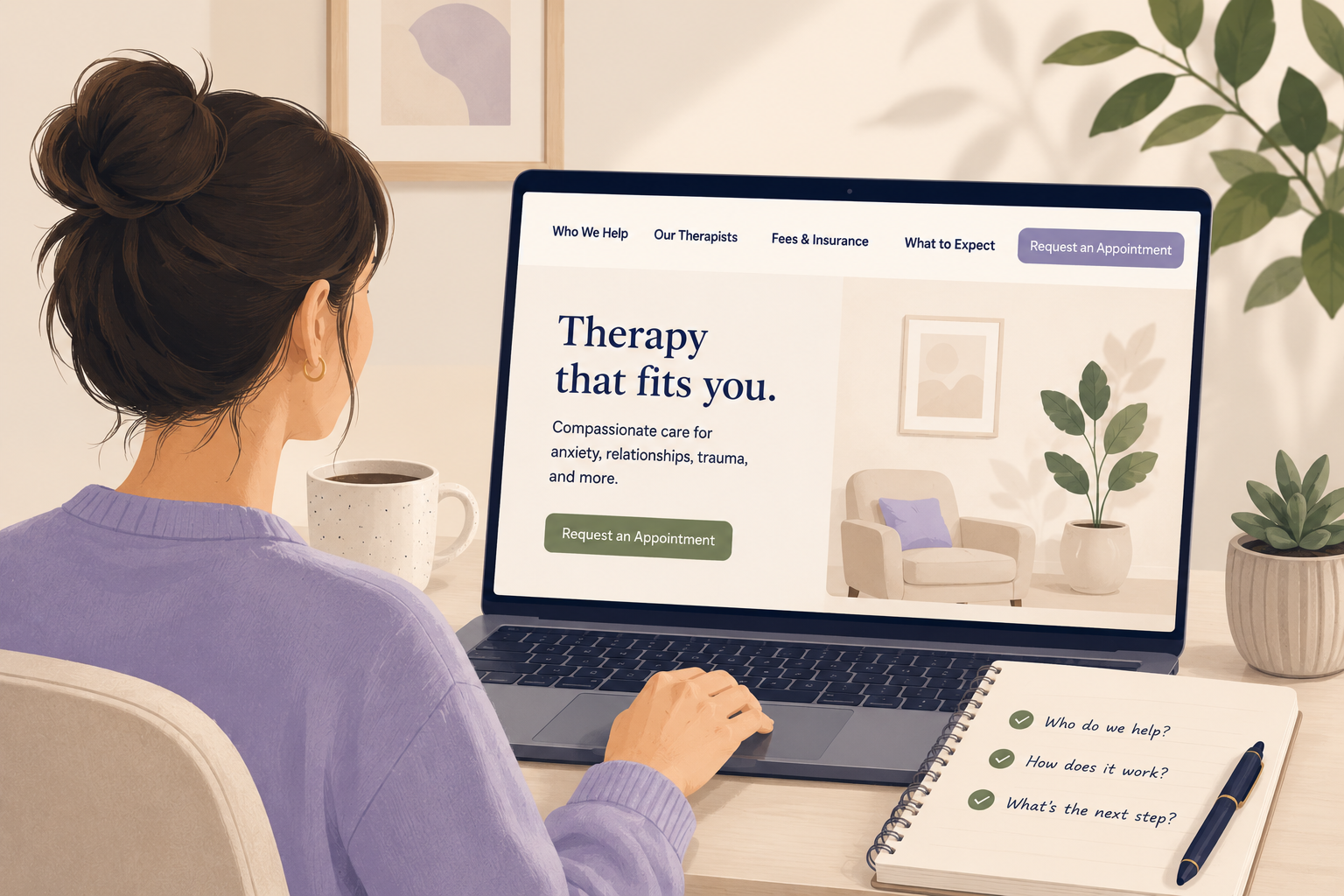
Your navigation menu is not just a list of pages. It can help a nervous visitor decide, “This practice might be for me.”
Have you ever looked at your therapy practice website and thought, “It looks professional, but I am not sure it helps people choose”?
The design may be clean. The photos may be warm. The pages may technically be there.
But when a potential client lands on the site, the menu at the top may still say something like:
Nothing about that is wrong. It is familiar. It is normal. It is also a missed chance to help someone understand whether they are in the right place.
This matters because many potential clients are using practice websites to take action, not just browse. SimplePractice’s 2025 report found that 62.7% of clinicians used Online Appointment Requests, a tool that lets clients schedule from shared open timeslots. If your menu hides the path to services, fees, availability, or scheduling, the next step can feel harder than it needs to.
It is also easy to underestimate navigation. Baymard’s 2025 benchmark found that 67% of mobile sites had mediocre-to-poor homepage and category navigation UX. That research is not therapy-specific, but the lesson applies: if people cannot quickly find the path that fits their need, they hesitate.
A clearer navigation menu will not make therapy feel like a sales process. It simply helps the right person find the right path with less guessing.
The quiet problem
Your menu may be clear to you, but vague to the visitor.
A potential client is not reading your website like you are reading your website.
You know what “Services” means.
You know which page explains anxiety therapy, couples therapy, testing, EMDR, teen therapy, or medication management.
You know whether “About” means the owner’s story, the team page, the practice values, or all of the above.
But a website visitor is usually moving faster.
They may be on their phone. They may be comparing three practices. They may be trying to figure out whether you help with their specific concern, whether you take their insurance, whether you have openings, or whether they should reach out at all.
When the menu is generic, they have to do more work.
And when someone is already overwhelmed, confused, embarrassed, worried about cost, or nervous about starting therapy, extra work matters.
The small bottleneck
Your website menu may not be broken. It may just be written from the practice’s point of view instead of the visitor’s point of view.
That is the issue this tip fixes.
The practical tip
Rename one or two menu items so they answer the visitor’s real question.
You do not need to redesign your whole website.
You do not need a clever menu.
You do not need to turn every page title into a long phrase.
This week, look at your main navigation menu and ask:
“Would a new visitor know where to click if they were trying to decide whether we are the right fit?”
Then improve one or two labels.
That is it.
The goal is not to make the menu creative. The goal is to make it easier for the right person to move forward.
For many therapy practices, the biggest opportunities are usually in labels like:
- Services
- About
- Contact
- Fees
- Team
- Resources
These labels are not wrong. They are just broad.
Broad labels make the visitor interpret what is underneath them. Clearer labels reduce that effort.
Before and after
Here is what this can look like in a practice website menu.
Generic menu
Clearer menu
Notice what changed.
The second version does not sound flashy. It does not overpromise. It does not pressure anyone.
It simply answers more of the questions a potential client is likely to have:
- Do you help people like me?
- Who would I be meeting with?
- Can I afford this?
- What happens after I reach out?
- Where do I go when I am ready?
Those are the questions that often decide whether someone keeps reading or leaves.
What changed
The menu became a guide, not just a filing system.
Many practice websites are organized around internal categories.
That makes sense from the owner’s side. You are thinking about your pages, your services, your clinicians, and your resources.
But the visitor is thinking about their own next step.
That is why small wording changes can make a real difference.
| Instead of only saying | Try something closer to |
|---|---|
| Services | Who We Help |
| About | Our Therapists |
| Contact | Request an Appointment |
| Insurance | Fees & Insurance |
| FAQ | What to Expect |
You do not have to use these exact words.
The right menu depends on the practice. A testing practice may need “Testing Services.” A group practice may need “Find a Therapist.” A psychiatry practice may need “Medication Management.” A practice with a strong referral partner audience may need “For Referrers.”
The point is to choose labels that match the visitor’s decision process.
How to adapt it safely
Keep the menu clear, simple, and clinically appropriate.
A therapy practice website should not feel like a pushy sales page.
Clear navigation does not mean exaggerated promises. It means helping people understand where they are, what you offer, and what to do next.
Here are a few simple rules to keep this grounded:
Use words clients actually use.
A visitor may not think, “I need evidence-based treatment for mood disorders.” They may think, “I need help with anxiety,” “My teen is struggling,” or “We keep having the same fight.”
Do not make the menu too long.
Clarity does not mean listing every service in the top menu. Too many choices can create a different kind of confusion.
Use dropdowns carefully.
A dropdown can help if you have several clear service categories. But if the dropdown has too many options, people may feel lost again.
Make the next step obvious.
If the main action is to request an appointment, say that. “Contact” is fine, but “Request an Appointment” is often clearer.
Do not hide cost information.
If fees, insurance, superbills, or payment options are common questions, make that path easy to find.
This is not about making your website perfect.
It is about removing one small point of friction.
Quick check
Look at your menu for 60 seconds.
Open your website on your phone and look only at the top menu.
Then ask yourself:
Mini self-check
If I were a new visitor, would I immediately know where to click to understand who this practice helps, what it costs, who I might see, and how to take the next step?
If the answer is “not really,” choose one menu label to improve this week.
Not five.
Not the whole site.
Just one.
For example:
- Change “Contact” to “Request an Appointment.”
- Change “About” to “Our Therapists.”
- Change “Services” to “Who We Help.”
- Change “FAQ” to “What to Expect.”
Then notice whether the website feels easier to understand.
Your navigation menu is a small part of your website, but it carries a big job. It helps the visitor decide where to go next. Make that next step easier to see.
